Elizabeth's Data Science Blog


I’ll conclude my data visualization series with a tutorial on time series graphs. We will continue to use MLB data from R’s Lahman package. Specifically, we’ll look at Babe Ruth’s home run totals for each year of his career. Next time, I’ll show you how to put these visualizations together in a dashboard so they are tidy and presentable.
Similar to my previous visualization posts, we will begin by installing the required R packages:
library(Lahman)
library(dplyr)
library(ggplot2)
library(ggiraph)We’ll again use dplyr to extract the data we would like to look at. we’ll first filter using Babe Ruth’s playerID and then select the yearID and HR (homeruns) columns. Save this information into a dataframe named “df.”
df<-Batting%>%
  filter(playerID=="ruthba01")%>%
select(yearID,HR)To begin creating your time series graph, plot a line using the year for the x-axis and homeruns for the y-axis.
ggplot()+
  geom_line(data=df,aes(x=yearID,y=HR))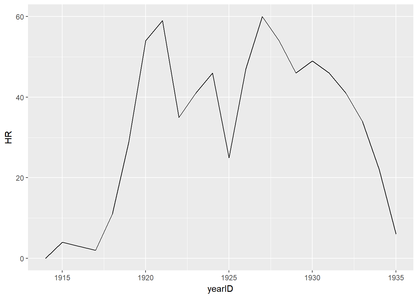
Next, add points to define each year on the graph. Notice the aesthetics remain identical.
ggplot()+
  geom_line(data=df,aes(x=yearID,y=HR))+
  geom_point(data=df,aes(x=yearID,y=HR))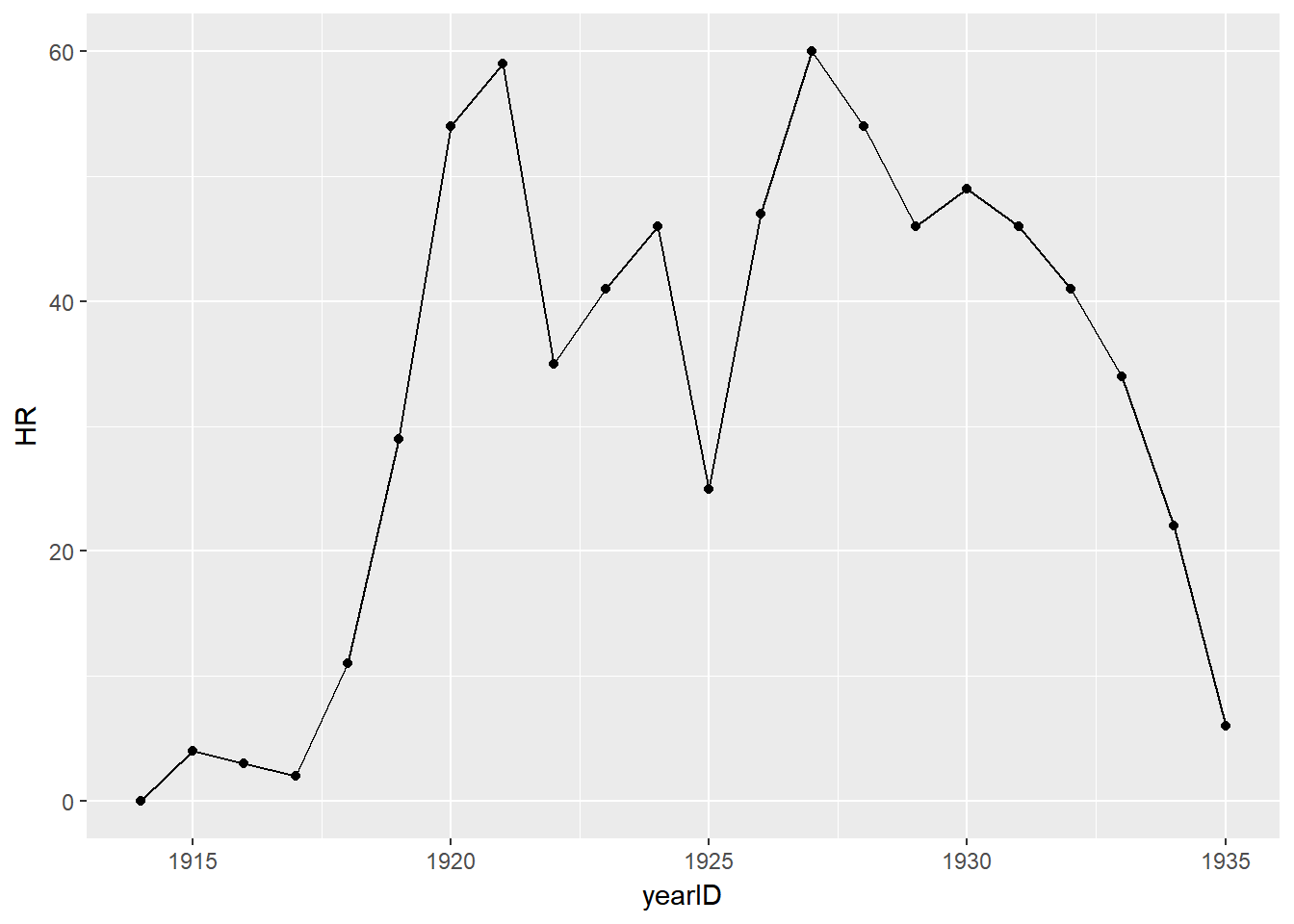
To make the graph interactive, change your geom_point line and set the tooltip to homeruns. Don’t forget to run the ggiraph function to display your graph.
g<-ggplot()+
  geom_line(data=df,aes(x=yearID,y=HR))+
  geom_point_interactive(data=df,aes(x=yearID,y=HR,tooltip=HR,data_id=yearID))

ggiraph(code=print(g),hover_css="fill:white;stroke:red")2 Oct 2017 #Data Visualization #Baseball